
You don’t have to look far to realize that fonts can either make or break any design. Its importance in email is no less. No matter what part you play in the production of email, it is crucial that you understand a few things about font and what it can and cannot do. Mastering this knowledge will ensure that hours spent designing or developing an email are not wasted simply because it's unreadable to its audience.
This post will begin with the basics of font and how they can be used in email to customize your brand and make it something really special. You will also notice a few attributes of font, that while still important, you will not have to concern yourself with, unless you are a professional email developer/designer and would like to custom code on your own.
Email Font Basics
The font is how a letter or string of letters appears or is displayed. And there are a vast number of different styles to choose from countless locations, some even boasting more than 130,000. Each is unique and can add a certain message or help to emphasize a point in your email content. But to understand what fonts you should use, it is important to understand the different parts of font and how you can change those attributes to fit your needs.
These are attributes that FireDrum’s email design studio incorporates and allows you to make adjustments where you want to. Do want your text larger or bolder? How about the color of it or the background images used? You can change all this on your own, making your branding emails exactly what you need.
Serif vs. Sans-Serif
Firstly, there are two basic types of fonts:
- Serif – characterized by curls on some letters
- Sans-serif – fonts without these tails or curls

You may find that you prefer one basic type over the other, however, each has its purpose and should be considered in light of the project being designed. FireDrum has a large number of both types already loaded into its email design studio for you to choose from.
Font-Size
Font-size is simply how large your text appears on the page. Fonts can be measured using pixels (px), points (pt), percentage (%), viewport width (vw), em, and relative em (rem).
The most commonly used and supported measurement by email clients is pixels. With that being said, both vw and em both have many email clients that support them and should not be overlooked.
Line-Height
Line-height, the height of the line your font is on, is measured using the same units used for font size. Some email clients such as Outlook require that the line-height be set to correctly display your font. Just remember that line-height is typically larger than your font-size. A good general rule of thumb when figuring out the correct line-height in pixels is to add six to your font-size. For example: font-size: 16px; line-height: 22px
Letter-Spacing
Quite simply, this is the amount of space between each l e t t e r. Typographers typically call this kerning, you may have even noticed this word in the font settings of several programs. Using this spacing can help to draw special attention to a certain line or word or to make the font more legible. This is defined using the same units of measurement that both line-height and font-size are.
Font-Weight
Font-weight is the thickness of your letters. For many fonts, this can be normal or bold. However, there are many more that can be defined as lighter, normal, bold, or bolder. There are yet others still that are given a number in 100 intervals going up to 900, with 100 being the lightest. If this is the case, you will to be sure that you import or link these number weights for your font otherwise the email client will choose the number for you. Some email clients may also only have two of these: 400 (normal) and 700 (bold).
Font-Style
Changing a font-style from normal to italic or normal to oblique (often known as faux italic) can add emphasis to certain areas of your email.
Text-Transform
Text-transform changes how the letters look in terms of the case they presented in. The following are the most commonly used forms of this:
- Lowercase – removes all capital or uppercase letters
- Uppercase – MAKES ALL LETTERS UPPERCASE
- Capitalize – Adds A Capital Or Uppercase Letter To The Start Of Every Word, But Not Immediately After A Number (For Example, ‘4th’ July)
Font Color
Just as the font of your text is likely to convey a certain look and feel, the color of that text can really make sure it gets noticed and taken seriously.
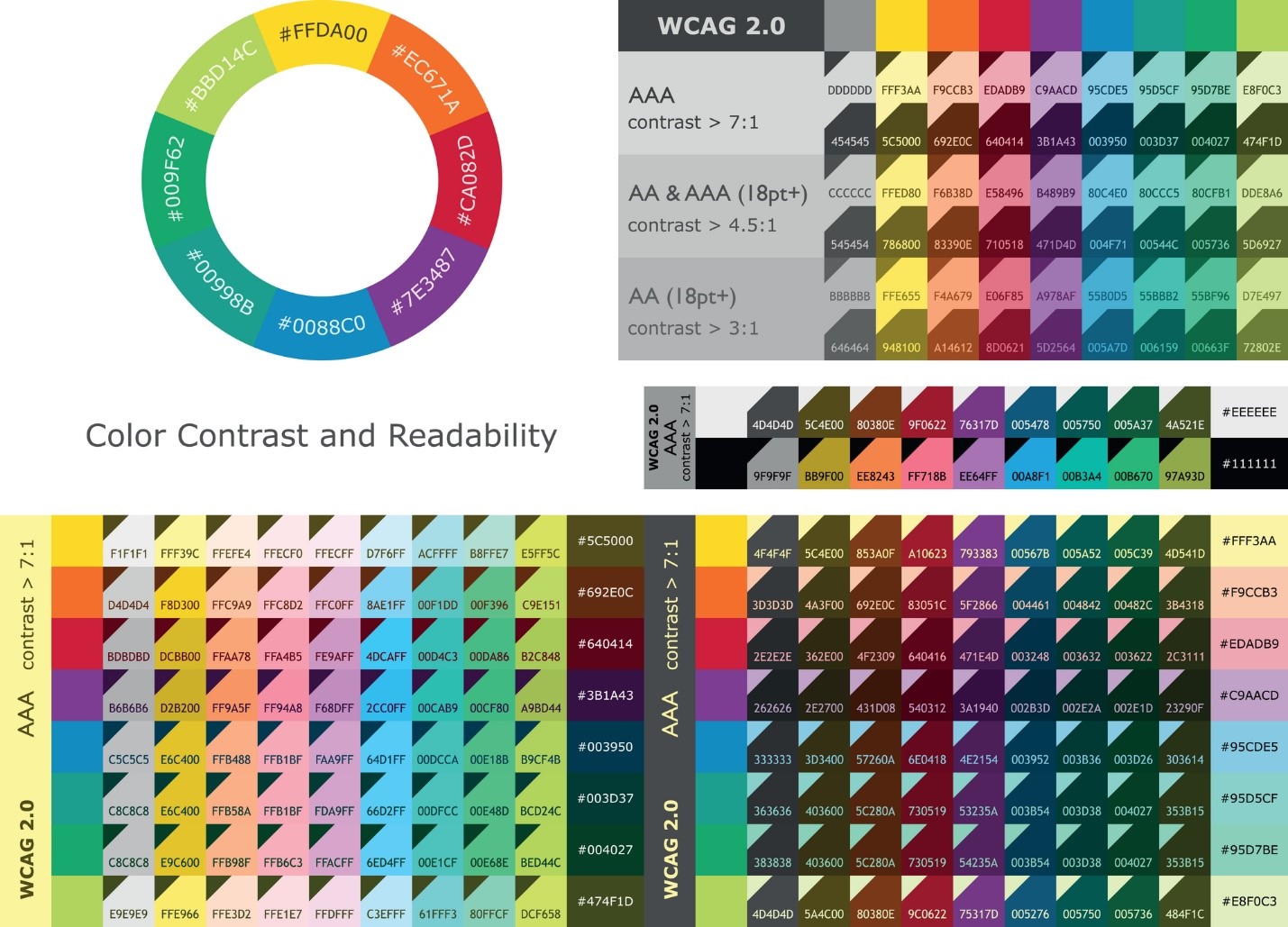
One of the most important aspects of color is contrast. You want to make sure that your letters can easily be read on your specific background. If the contrast is too low or too high, it may be difficult to see clearly, let alone read. To help you understand what your emails (or other digital content) should include when it comes to color the Web Content Accessibility Group (WCAG) has created some guidelines for contrast ratios. In addition to this, there are several online tools to check how your font contrast compares, including WebAim’s Color Contrast Checker.
For fonts being used in combination with background images, make sure you have a good fallback background color. Most email clients support background images; however, they may load very slowly. Make sure the reader doesn’t miss your message by not having the right background for your text in the meantime.
Photo Credit: vector ID 77527184
https://depositphotos.com/77527184/stock-illustration-color-contrast-and-readability-between.html
Pro Tip: Black (#000000) on White (#FFFFFF) can be rather harsh. A quick way to soften your color combination and make it easier on the eyes would be to change the Black to #000001.
Honorable Mentions
In addition to these, there are two more attributes of font. They and their descriptions can be found below. It is important to note that while these are an important part of fonts, they are rarely used or adjusted. FireDrum’s development experts, in regards to x-height, and font-variant use the best version of this for each font available and therefore, changes to it are automatically adjusted or not needed.
Font-Variant
Closely related to text-transform is font-variant, which can be used to display all letters in uppercase but makes letters that would be normally be capitalized larger than those around it at lowercase height.
X-Height
The x-height is just as it sounds. It is the height of the letter ‘x’ in any font. Not all email clients (Outlook, Apple Mail, Gmail, etc.) support the same fonts (more on this later). Therefore, it is wise to pick several fonts that look similar when you are designing your emails so that when one is not supported the other one can be used to give the same effect. Choosing fonts with the same x-height is a good indicator that they will display similarly.
Unfortunately, not all email clients support every font. This can create some frustration and confusion on the reader’s part when they are looking at your email. But it doesn’t have to.
To make sure your emails look exactly like the original design you need to make sure you choose a web-safe font. This is a font that is already loaded onto a recipient’s computer or device. Choosing a web-safe font is also the safest way to give the widest audience possible your original designs. FireDrum’s email editor has a long list of fonts which are all considered web-safe and offer you quite a bit of variety. They also incorporate a number of popular Google fonts that are web-safe.
For Mac and Windows users, Arial, Verdana, and Tahoma are considered web-safe sans-serif fonts and are supported almost 100% of the time. For Apple devices, try using Helvetica.
The best web-safe serif fonts for both Mac and Windows are Georgia and Times New Roman.
For more information on specific fonts and the percentages of users with access check out CSS font stack.
Font Stacks in Email
To ensure each recipient is able to read your email no matter what font you chose in your original design, a font stack is generally used. This is essentially a preference order of fonts set up so that if the device or computer the email is being opened on doesn’t support your first choice, the reader is still able to see your message in a similar font. This can be done by putting your preferred font in the head of the email or by giving an inline style font stack with the font-family.
Here is an example of what a sans-serif inline font-stack might look like:
style=”font-family: Helvetica, Arial, sans-serif;”
For further explanation of this example, an Apple user would see the email in Helvetica. A Windows user, who doesn’t have Helvetica, will see it in Arial. And someone who has neither Helvetica or Arial would see whatever sans-serif font that is defaulted on their device.
FireDrum’s Email Studio makes sure to include the best font stacks for every scenario in each email that you create, producing an email that everyone can read.
Mobile-Specific Font-size
In addition to making sure your font is readable for all email clients, it is important that they can be viewed on all devices as well. After all, over half of your email subscribers are probably checking their email from a smartphone or tablet instead of a desktop computer, which may have a considerably smaller screen.
The main concern when it comes to mobile emails is font-size. This needs to be adjusted for specific screen sizes using a media query in the email’s coding. Here the units vw are using instead of pixels as the size of anything on the screen is in direct relation to the size of the device’s viewport width (vw). The iPhone 7, for example, has a viewport width of 750px. This means that the text being read needs to be a certain percentage of that to be legible. In most cases, 2% or a font size of 2vw will work. And typically, once this is set in your email’s code, it will respond accordingly to any size of vw as needed.
Similarly, the line-height must also be changed so that your text isn’t scrunched. Most email designers have to play with this a bit to get it just right. If we use the example given above, a line-height of 3vw should leave your text plenty of space.
If you are already a FireDrum user, you know that their email studio lets you preview your created content for almost 70 different sizing scenarios and devices, never having to worry about all the coding behind it. They take the hassle of custom coding all the necessary sizing changes and conversions upon themselves and let you focus on simply making your brand the best that it can be.
Custom Fonts in Email
The FireDrum email studio allows you to create custom designs for your emails with a long list of available web-safe fonts to choose from.
However, it is possible you may have found a font that is not included in their list that you prefer. If this is the case, you can custom code your own HTML newsletter, and send it through FireDrum. If you are familiar enough to design HTML email, you can add this font to your emails yourself. You may also know someone who has these skills and can do it for you.
The following section will address a couple of the most popular ways to code your own fonts into emails. Just remember the above-mentioned information about font stacks and adjustments for mobile emails, as they will be needed.
Importing Web Fonts
About 50% of the top email clients now support importing your choice of web fonts, including the following:
- Apple Mail
- iOS Mail
- Samsung Mail
- com
To find a web font all you need to do is search online. Some will need to be purchased, while others are free. Just be sure to check out the license on any font you decide to use. Some may be limited to certain uses only or may cost more depending on that license. The following sites are some of the most recommended for finding web fonts:
- com (130,000+)
- Google fonts (915)
- Font Shop
- Creative Bloq’s 76 best free web fonts
<link>
<link> is the simplest method of importing a font into your emails. To use a font throughout your email, a line of code, similar to the one below, must be added in the head of your email.
<link href="https://fonts.googleapis.com/css?family=Lora" rel="stylesheet">
To use, simply find the hosted link to the web font you want to use and place it in the href=””. Note that this link will be loaded inline with the HTML, so be ready to wait a while for it to load large font files when your emails are opened.
This is also where your inline font-stack can be used. The following is an example of a serif font stack code using the font “Lora”:
<td style=”font-family: ‘Lora’, Georgia, Times New Roman, serif;”>Lorem ipsum dolor sit amet</td>
@font-face
The best way to include a specific font and have it look consistently the same in your emails is to use @font-face. This is because it is the method supported by the most email clients.
However, to use this method you must be able to find certain formats of your preferred web font. Web fonts can be found in .svg, .eot, .ttf, .woff and .woff2. When using these for email purposes, only .woff and .woff2 versions of links should be used.
This is because they are the most widely supported across all email clients. This also enables you to get very specific about your font attributes, such as font-weight and font-style. To include your font-stack using this method, you would include it with the font-family attribute inline.
In Conclusion
By learning a few font basics and how to use them efficiently in your emails, you can now create brand designs and emails that engage and convert, keeping your readers involved and coming back for more. Use FireDrum’s email design studio and your new font knowledge to bump up your email game today. And for those who are experienced with HTML designs, or know someone who is, feel free to use the coding portion of this as brief guide for custom font use in emails.