Simple Holiday Color Schemes Stand Out
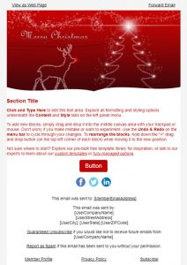
While the holidays tend to be a more colorful season than the rest of the year, it doesn't mean that your holiday emails color scheme should be overbearingly colorful. Take for an example the following Christmas email template.
As you can see here, there are only a few colors in the entire template. The main colors being red and white, both Christmas related. If you were to add other Christmas related colors (like green and gold), it would very likely make everything a mess and difficult for the reader.
By keeping colors simple, you'll be able to grab your subscribers' attention, get them to click on your call to action, and generate a sale from them.

Don't let the rest of the holidays sneak up on you, Download Our 2018 Holiday Email Guide!
Simplified Layout Makes the Most of a Holiday Email
During the holidays, people's free time to shop is very limited. This is because aside from doing some holiday shopping they have to prioritize balancing a job, raising a family, and/or entertaining others during the season. And when they do find time to look for deals and offers, they aren’t going to scroll through emails with walls of text and large unsightly images. Most likely marketing emails like those are likely to be discarded and/or flagged as spam.
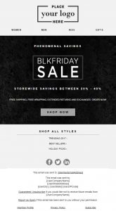
The solution is to keep your template simple yet informative. Like the following Black Friday Sale template offered at Firedrum.
As you can see in the template, there are only a few images set up (the logo, the Black Friday sale, and the social media links). The rest is mainly text, links, and call to actions. This simplified email layout is perfect for the holidays, especially during Black Friday, when everyone's time to shop is very limited.
Simple is Best for Mobile Holiday Emails
Since more people are shopping through mobile than desktop or in-person, having your holiday email focused around mobile devices is a smart way to go. Emails that aren't optimized for viewing on a cell phone or tablet device are very likely to cause your subscribers frustration and end up their trash folder.
As you can see the in the example above, the text and the image has been optimized and scaled down to fit most (if not all) mobile devices and tablets. Everything is legible and easy to understand. The images and call to action are perfectly positioned for subscribers to engage with. If your emails in the past have had viewing problems, consider looking into a service that can optimize your mobile email marketing layouts and strategy.


Is Your Holiday Email Marketing Strategy Ready for the Busiest Time of the Year?
When it comes to email marketing, especially during the holiday season, keep in mind the phrase "simple is best". While businesses might be enticed by using a variety of colors, vivid descriptions, and new types of layouts, it might not be for the best. The more complex they are, the more likely your readers could get distracted. So, keep it simple and to the point for your email subscribers during this upcoming holiday season.
With the holidays right around the corner, it's crucial to start your email marketing early! Have you downloaded our 2018 holiday email guide? Our gift to you, it includes a complete holiday sending calendar plus email acquisition and engagement tips.
