Let’s Be Honest… Most Emails Are Terrible
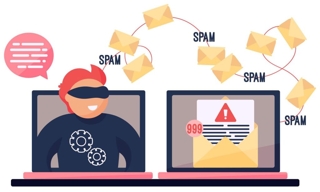
Let’s face it: most marketing emails never see the light of day. They get deleted faster than they’re opened, or worse, they land in the spam folder, never to be seen again. The ones that do get opened? They often look like digital billboards stuffed with too much text, mismatched colors, and three different calls to action fighting for attention. Instead, you need to design emails that convert, rather than fluff.
Here’s the truth: great email design isn’t about being flashy or clever, but about being clear. The best-performing emails use psychology, structure, and simplicity to guide readers toward one goal: clicking a link, scheduling a call, or buying a product.
By the end of this guide, you’ll know how to design an email that people actually read and click. You’ll learn how to think like your reader, design with purpose, and apply real-world tactics that turn inbox clutter into conversions.
Step 1: Start with a Goal, Not a Template
Before you even think about colors, buttons, or catchy headlines, you need to ask one simple question: “What do I want this email to do?” Every high-performing email starts with a single, clear goal. It’s there to get one thing done. That might mean selling a product, getting someone to sign up, booking a demo, or sharing an update.
For Dummies Tip: If your email tries to do five things, your reader will do none of them. The truth is, your audience’s attention span is short. If your message doesn’t have direction, they’ll move on. So, define your purpose before you start designing. Here are three common goal types to guide your thinking:
- Awareness: Introduce a new product, event, or feature.
- Conversion: Encourage a specific action, like clicking a link or making a purchase.
- Retention: Keep current customers engaged through updates, tips, or exclusive offers.
Once your goal is clear, reverse-engineer your design around it. The headline, images, copy, and call-to-action should point toward that single outcome. If the goal is to drive clicks, make your CTA button the star. If it’s awareness, use strong visuals and short copy.
Start with clarity, and your email will have focus. Start with a template, and you’ll end up designing for the wrong reason.
Step 2: Write a Subject Line That Gets Opened
![]()
You could design the most beautiful, perfectly crafted email in the world, but it won’t matter if no one opens it. Your subject line is your first impression, and in a crowded inbox, it’s often the only thing standing between your message and the delete button. Think of it as your headline, handshake, and elevator pitch all rolled into one.
So how do you get people actually to click? Start with these simple rules:
- Keep it under 50 characters. Shorter subject lines get read faster and display better on mobile.
- Use curiosity or benefit. A good subject line teases value (“You’re going to love this shortcut”) instead of tricking readers into opening something they’ll regret.
- Test personalization and emojis, but sparingly. Adding a name or a relevant emoji can make your email stand out, but too many can make it look spammy.
Here are a few examples to show the difference:
Bad: “Exclusive Limited Time Offer Act Now!!!”
Good: “Save 20% today—your weekend upgrade awaits”
Bad: “Check Out Our Newsletter”
Good: “3 easy ways to simplify your workday”
For Dummies Tip: Pretend you’re texting a friend. If it sounds robotic, rewrite it. Your readers want real, human communication, not marketing-speak. If your subject line makes them curious, promises value, and feels authentic, they’ll open it, and your email has a fighting chance
Step 3: Keep Design Simple and Scannable
Most people don’t read your emails; they skim them. Your reader is scrolling through dozens of messages, so your design has to pass what we’ll call the “3-second test.” In three seconds or less, they should know what your email is about and what you want them to do.
That means keeping your layout clean, clear, and easy to digest. Here’s how to structure it:
- Header: State your message in one sentence or a single, attention-grabbing image.
- Body: Keep the copy short, direct, and broken into small chunks. Use bullets or line breaks to create rhythm and flow.
- CTA: End with one clear button or link that drives your main goal. It can be “Shop Now,” “Read More,” or “Book a Call.”
For Dummies Tip: White space is your best friend. Crowded emails feel like homework. Empty space gives your design breathing room, helps key elements stand out, and keeps your message from feeling overwhelming.
Mini visual example: Imagine your email as a landing page, clean, consistent, and clickable. Every word and image should guide the reader’s eye toward the next step, not distract them from it. When in doubt, simplify. A clear message always converts better than a busy one.
Step 4: Use Images Strategically
Images can make your email more engaging and easier to digest, but like salt in a recipe, too much ruins the mix. Visuals should guide attention, not steal the spotlight. When used strategically, they help your reader focus on what matters and support the message you’re trying to communicate.
A good rule of thumb? Aim for a 60% text and 40% image balance. That’s enough visual interest to capture attention without overwhelming inbox filters or your reader. Too many images can slow load times and even trigger spam warnings, especially on mobile devices.
Here are a few best practices for smarter image use:
- Use alt text. It helps spam filters understand your content and ensures your message still makes sense if images don’t load.
- Optimize file size. Compress large images so your email loads quickly on all devices (especially mobile).
- Avoid image-only CTAs or text. Your most important copy, like your headline or call-to-action, should always appear as text, not embedded in a picture.
For Dummies Tip: If your image doesn’t make someone click or feel something, it’s just decoration.Your visuals should earn their spot. A great image grabs attention, reinforces your message, and evokes an emotion. Keep it purposeful, keep it simple, and let your design work smarter, not louder.
Step 5: Make Your CTA (Call-to-Action) Impossible to Miss
Your call-to-action (CTA) is the single most important element in your entire email. It’s the bridge between interest and action. This is the moment your reader decides whether to click or close. You can have great design, strong copy, and a beautiful layout, but if your CTA doesn’t stand out, your conversion rate will crash faster than an overhyped campaign.
A good CTA is a visual cue that commands attention and tells your reader exactly what to do next. Here’s how to make yours work:
- Use a contrasting color that fits your brand palette but still stands out from the background. If your email is mostly neutral tones, make your button bold.
- Write actionable copy. “Get Started,” “See How It Works,” or “Claim My Spot” sound exciting. “Submit” sounds like homework.
- Repeat it strategically. For longer emails, place a CTA near the top and another at the bottom to catch readers who scroll.
To add a little psychological magic, try these subtle motivators:
- Urgency: “Ends Tonight” or “Limited Spots Available” encourages immediate action.
- Social Proof: Statements like “Join 5,000 others using this” or “See why customers love it” build trust.
For Dummies Tip: If your CTA blends in, it’s invisible. Make sure your button pops. Use a larger font, bold color, and plenty of breathing room around it. The moment someone opens your email, their eyes should know exactly where to click. That’s how you turn good design into measurable results.
Step 6: Design for Mobile First
Here’s a stat that should shape every email you send: more than 70% of all emails are opened on a mobile device. That means if your design only looks good on a desktop, you’re already losing most of your audience before they even see your message.
When someone opens your email on their phone, they’re multitasking. They’re waiting in line, scrolling between apps, or half-watching TV. You have a few seconds to grab their attention and make your message effortless to read. That’s why your design should focus on clarity, simplicity, and touch-friendly navigation from the start.
Here are the key mobile design rules to live by:
- Use a single-column layout. Multi-column designs that look great on desktop often break or become unreadable on smaller screens.
- Make your CTA button thumb-friendly. Large, centered, and easy to tap. No one should have to pinch or zoom to click it.
- Keep text legible. Use a font size of at least 14pt for body text and 20–22pt for headlines.
- Write short subject lines and preview text. Mobile inboxes truncate anything long, so keep it concise and impactful.
For Dummies Tip: If you have to pinch and zoom to read it, your readers won’t bother. The best mobile-friendly emails are clean, fast-loading, and friction-free. Test your design on different devices before you hit send. If it’s easy to scroll, tap, and read on your phone, it’ll look great everywhere else too.
Step 7: Test, Tweak, Repeat
Before you hit send on that “perfect” email, here’s a reality check: no email is perfect the first time. Even experienced marketers know that testing is what separates good emails from great ones. The best-performing campaigns come from data, not guesswork.
Testing lets you understand what your audience actually responds to, not what you think they’ll like. Start with simple A/B tests. Try two different subject lines, CTA buttons, or design layouts and see which version performs better. Small changes, like button color or headline wording, can make a big difference in clicks and conversions.
Always preview your emails across multiple platforms before sending. Emails can display differently in Gmail, Outlook, Apple Mail, or on mobile. What looks flawless on your screen could break on someone else’s. Tools that let you preview across devices are worth their weight in gold.
Once the email is live, track key metrics like open rate, click rate, and conversions. These numbers tell you what worked and what needs tweaking.
For Dummies Tip: Your first draft isn’t your best. It’s your test. Email marketing isn’t a one-and-done effort. It’s an ongoing experiment. Keep learning from your data, refine your strategy, and repeat what works. The more you test, the more predictable and profitable your results become.
Great Design Doesn’t Sell, Clarity Does
At the end of the day, flashy design doesn’t sell. The best emails aren’t the ones with the most colors, fonts, or fancy graphics. They’re the ones that clearly communicate value, guide the reader effortlessly, and make the next step obvious. Simplicity converts because it respects your reader’s time and attention.
Before you send your following email, look at it through your customer’s eyes and ask yourself: “Is this clear, helpful, and worth a click?” If the answer isn’t an immediate yes, it’s time to simplify.
Need help designing emails that convert? Contact our team to build, test, and optimize your next campaign. We’ll help you turn clarity and strategy into clicks, conversions, and long-term results.