
Lightbox Types, Best Layouts, Integrations and More.
Popups (or lightbox forms), are everywhere these days. You’ve probably noticed a few different types while browsing the web, but I’m sure you remember the in-your-face ones the most. Believe it or not, there are ways to incorporate popups without being intrusive.
Our guide to designing popup forms share details and design ideas for several form layouts. We only explore the features and benefits of less invasive form types. Meaning, if you use any one of these layouts you can feel confident knowing your website visitors won’t complain. If you’re not sure what popup forms are, read our blog “Website Lightbox Forms - What, Why, When, and How.”
Exit Popup Form
Decide when you’d like your visitors to convert by setting up an exit-intent popup form. These types of forms can be configured to appear once a user hits the “exit” button on their browser. You can design something simple or extravagant, but either way, it should provide some urgency or reasoning why one should enter their email address.
Many of our email marketing users see a nominal increase in signups when they incorporate this exit popup form, but some see a decrease in engagement. Those who see a lack of involvement are typically missing key features that appear in this form below.
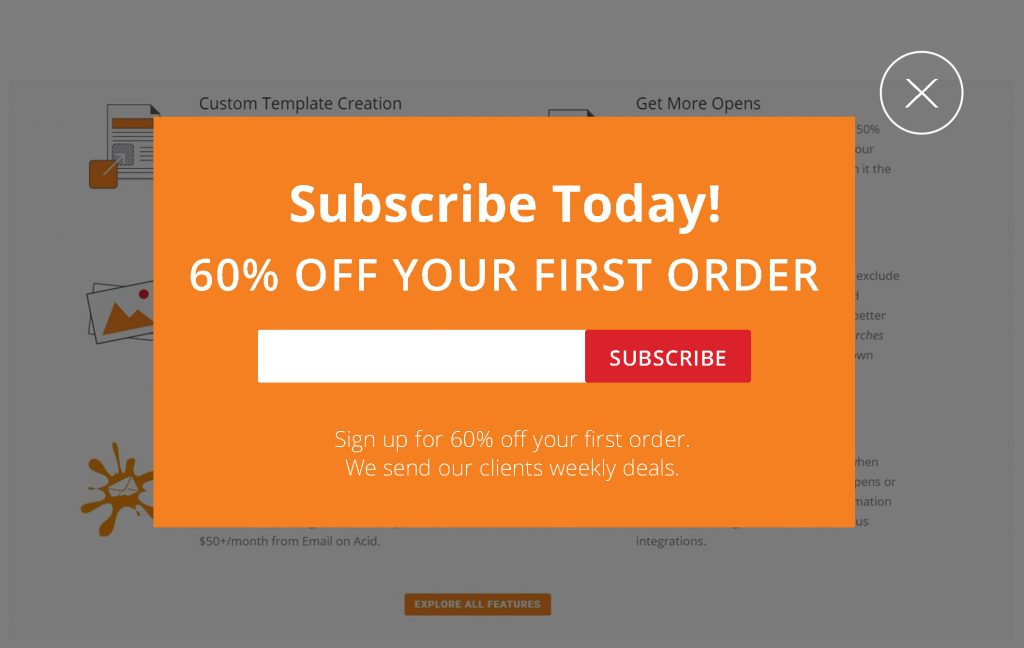
![]() Visible exit path. The “x” in the top right corner of the screen lets users know that they aren’t stuck on this page.
Visible exit path. The “x” in the top right corner of the screen lets users know that they aren’t stuck on this page.
![]() Large heading text. The title/subtext is large enough to read but also simple enough to understand so users can quickly gauge what the form is about.
Large heading text. The title/subtext is large enough to read but also simple enough to understand so users can quickly gauge what the form is about.
![]() Front and center email form field. Don’t make your clients hunt. On this example, it’s easy to find where your subscriber’s need to enter their email address. The large “subscribe” button is easy to push on both desktop and mobile views.
Front and center email form field. Don’t make your clients hunt. On this example, it’s easy to find where your subscriber’s need to enter their email address. The large “subscribe” button is easy to push on both desktop and mobile views.
![]() Screen overlay - ½ page. Some disagree with this opinion, but we believe ½ page forms are better than a full screen or ¾ screen overlays. This type of form still disrupts the scrolling process but doesn’t seem as invasive as having the whole screen blocked.
Screen overlay - ½ page. Some disagree with this opinion, but we believe ½ page forms are better than a full screen or ¾ screen overlays. This type of form still disrupts the scrolling process but doesn’t seem as invasive as having the whole screen blocked.
You can configure this type of form to appear when a user attempts to leave the site, or when a user opens a specific page. Some businesses even configure the form to appear minutes or seconds after a visitor opens their website. Learn more or get started with MailMunch - a FireDrum form integration.
Embedded Sidebar/Page Form
Embed forms requires no time, display, or exit-intent configuration. Instead, it’s designed to sit in a specific spot 24/7. These types of forms are meant for blog posts, landing pages, and even social media pages.
There is no real way you can “go wrong” with these forms, but it’s vital that you design with intent. Get specific about signup details and segment your lists to nurture interested parties.
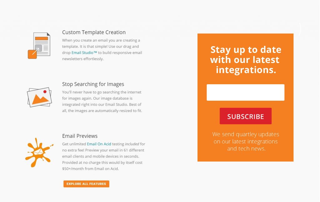
![]() No content overlay or blocking. These embedded forms should appear to be apart of the page/content.
No content overlay or blocking. These embedded forms should appear to be apart of the page/content.
![]() Large heading text that’s relevant to the content. The text size makes the form stand out.
Large heading text that’s relevant to the content. The text size makes the form stand out.
![]() Front and center email form field. Don’t make your clients hunt. This form makes it easy for visitors to enter their email address and push subscribe.
Front and center email form field. Don’t make your clients hunt. This form makes it easy for visitors to enter their email address and push subscribe.
Build your first embedded form/sidebar form with MailMunch or Wufoo. Both form builders integrate with FireDrum.
Top Bar (aka Banner) Form
With top bar forms, you can get in front of your clients without getting too “in their face.” These forms rest on top of your page content (or on top of the footer) and can be configured to stick while scrolling. Top bar forms can be customized to fit your branding and page style, and are perfect for collection new signups. Explore top bar form options with Privy - a FireDrum form integration.
We suggest incorporating top bar forms whether or not you’re testing/using other form types. These banners look beautiful and simple, which is code for it won’t annoy your users. When you design this form, keep in mind that it should take up minimal space.
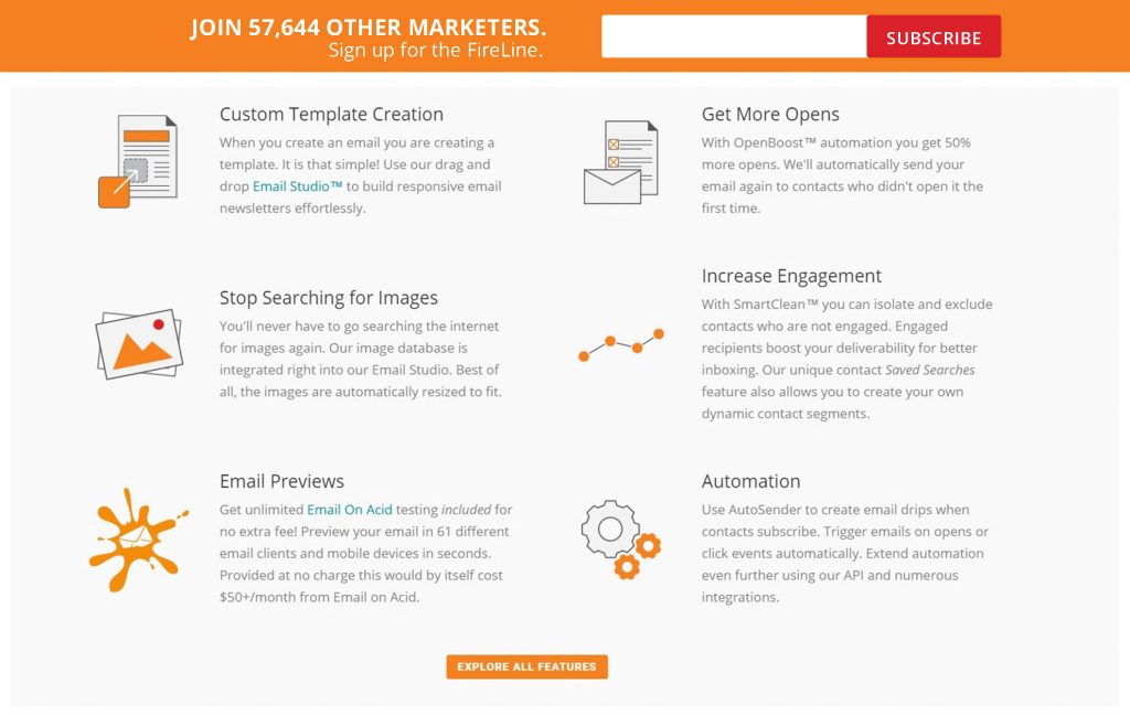
![]() No content blocking. The top bar isn’t limiting content visibility or taking up more than ⅙ of the screen view. This will make it easy for your users to navigate the page.
No content blocking. The top bar isn’t limiting content visibility or taking up more than ⅙ of the screen view. This will make it easy for your users to navigate the page.
![]() Large heading text that’s straightforward. Since we have a minimal amount of space, it’s essential that your text is to the point. In this case, we added actionable text and easy directions (sign up for the FireLine).
Large heading text that’s straightforward. Since we have a minimal amount of space, it’s essential that your text is to the point. In this case, we added actionable text and easy directions (sign up for the FireLine).
![]() Large email address field and subscribe button. Even with the limited space top bars provide, it’s essential that our form field is clear and easy to find.
Large email address field and subscribe button. Even with the limited space top bars provide, it’s essential that our form field is clear and easy to find.
![]() Limited information. The amount of content that you can fit into this top bar is limited, but not a total disadvantage. Use this to your benefit! Adding additional links to a separate landing page may increase time on site and conversions.
Limited information. The amount of content that you can fit into this top bar is limited, but not a total disadvantage. Use this to your benefit! Adding additional links to a separate landing page may increase time on site and conversions.
Slide Box Form (Popup on Slide)
Give your visitors the opportunity to sign up when they finish reading an article or get to the end of your landing page. This type of popup form typically yields more quality subscribers due to the placement. Why ask users to opt in when they’re not sure what you have to offer? By presenting this option at the end of your article, you’re giving them a chance to get to know your products/services before opting in.
Spend time designing these forms. Make them personal and relevant to the page they’re on. Although it may take time to segment your lists accordingly - it’s worth it! Nurture these subscribers with content they care about.
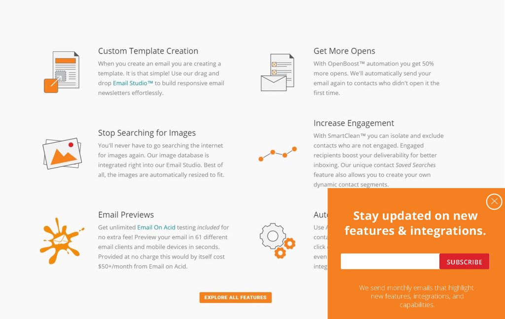
![]() Minimal content blocking. Making the form any larger that ⅙ of the screen would be annoying. This form is meant to be a “minimalist” attention grabber.
Minimal content blocking. Making the form any larger that ⅙ of the screen would be annoying. This form is meant to be a “minimalist” attention grabber.
![]() Clear exit path. Your visitors may not be finished reading the post/page! Don’t block the content from them. Make an exit path clear, or add a “minimize screen” option to the form.
Clear exit path. Your visitors may not be finished reading the post/page! Don’t block the content from them. Make an exit path clear, or add a “minimize screen” option to the form.
![]() Large title and descriptive text. Since you have the room, use it. Describe why they should sign up and sending details. Make sure your subscribe field and the submit button is easy to see and fill out.
Large title and descriptive text. Since you have the room, use it. Describe why they should sign up and sending details. Make sure your subscribe field and the submit button is easy to see and fill out.
Test slide in form options with MailMunch.
Landing Page Form
Last but not least, we have our landing page forms. These elegant forms are like our embedded layouts but act as the main focal point of the page section. That being said, make it your main focus! Include more form fields, a descriptive title, and additional opt-in information.
Instead of determining what content is on the form, it’s more important to work on the content that’s on the page. All sections should be encouraging people to fill out the form (whether it’s an event, a newsletter signup, or a general contact form. If this form is connected to your FireDrum account and is being used for other purposes aside from subscribing, make sure to add an opt-in checkbox option.
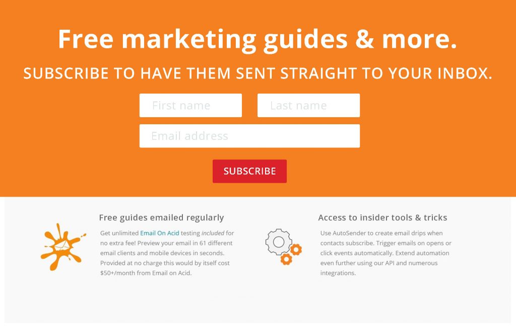
![]() Large title and descriptive text. The landing page makes these easy since our heading and form are the main focal points of this page. Since you have the room, make sure you're addressing all newsletter points and adding actionable text throughout the page.
Large title and descriptive text. The landing page makes these easy since our heading and form are the main focal points of this page. Since you have the room, make sure you're addressing all newsletter points and adding actionable text throughout the page.
Closing Notes
There are ways to incorporate lightbox forms without getting “all up in your face.” If this blog doesn’t prove it, I’m not sure what will! Design, test, and optimize these various form types before making any final decisions or opinions. You may find that some of these forms will double your daily signups.
Get expert advise about lightbox forms from our email specialists. We'll help you discover the best way to increase member sign-ups.